














The Colour Aesthetics of Custom Furniture, Hidden Beneath the Surface
Step into the world of custom Full Aluminum Furniture and the first thing people notice is usually the word "aluminium." It conjures images of the cold, the industrial, the bare metal. But what truly determines whether a piece of aluminium furniture can settle into a home was never the substrate itself—it is the fraction of a millimetre covering the aluminium: the colour, the grain, the touch, and that subtle expression it wears when light falls upon it.
At homeplus, we believe the real charm of aluminium customisation happens precisely at the surface. When aluminium learns to express colour and materiality, it ceases to be a mere substitute for woodwork and becomes an independent, honest choice within spatial aesthetics.
Solid Colour Series: The Breath of a Space Begins with a Quiet Wall of Cabinetry
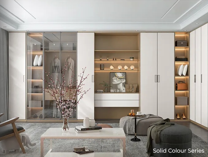
The solid colour series is the most demanding in craftsmanship—with no grain to conceal anything, the evenness of the coating, the matte finish, and the flatness of every edge are fully exposed to the eye. Powd
er coating allows an almost unlimited colour range, from low-saturation greige to high-saturation vintage green. Its value lies in giving the space
room to breathe: a full wall of matte cream or sage green cabinetry does not compete for attention, yet quietly sets the tone of the room. The 2027 interior design trend is shifting toward warm earth tones and soft neutrals, and solid-colour aluminium cabinetry is the ideal canvas to carry them—aluminium does not warp with moisture, so kitchens, bathrooms, and balconies can all have a cabinet wall in pure, enduring colour.
Wood Texture Series: Aluminium in Place of Wood, Without Pretending to Be Wood
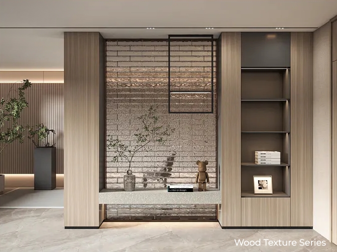
Wood grain transfer technology is now well established: high temperature infuses the grain into the coating, the touch carries a subtle relief, and visually it can reproduce a wide spectrum from light oak to dark walnut. But the balance must be right: the point of aluminium wood grain is not to "fool the eye into thinking it's solid wood." Aluminum's stability, moisture resistance, and zero formaldehyde are the real trump cards. The meaning of the wood grain series is this—when a space needs the warm expression of wood, you can have it without bearing the risk of solid wood swelling and moulding in damp environments. We especially recommend it for sideboards, the western-kitchen water bar, or balcony cabinetry; a two-tone approach with dark upper cabinets and light lower cabinets clearly defines functional zones without adding visual weight.
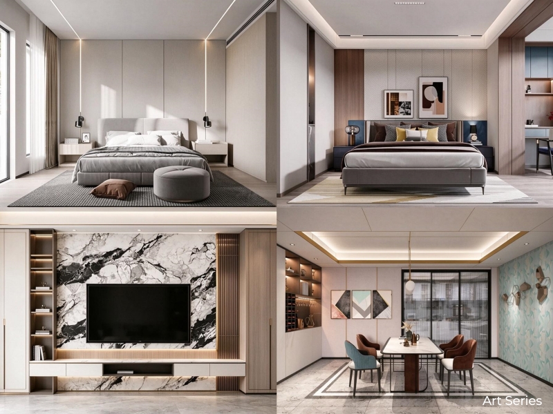
Art Series: When a Cabinet Door Becomes a Silent Wall
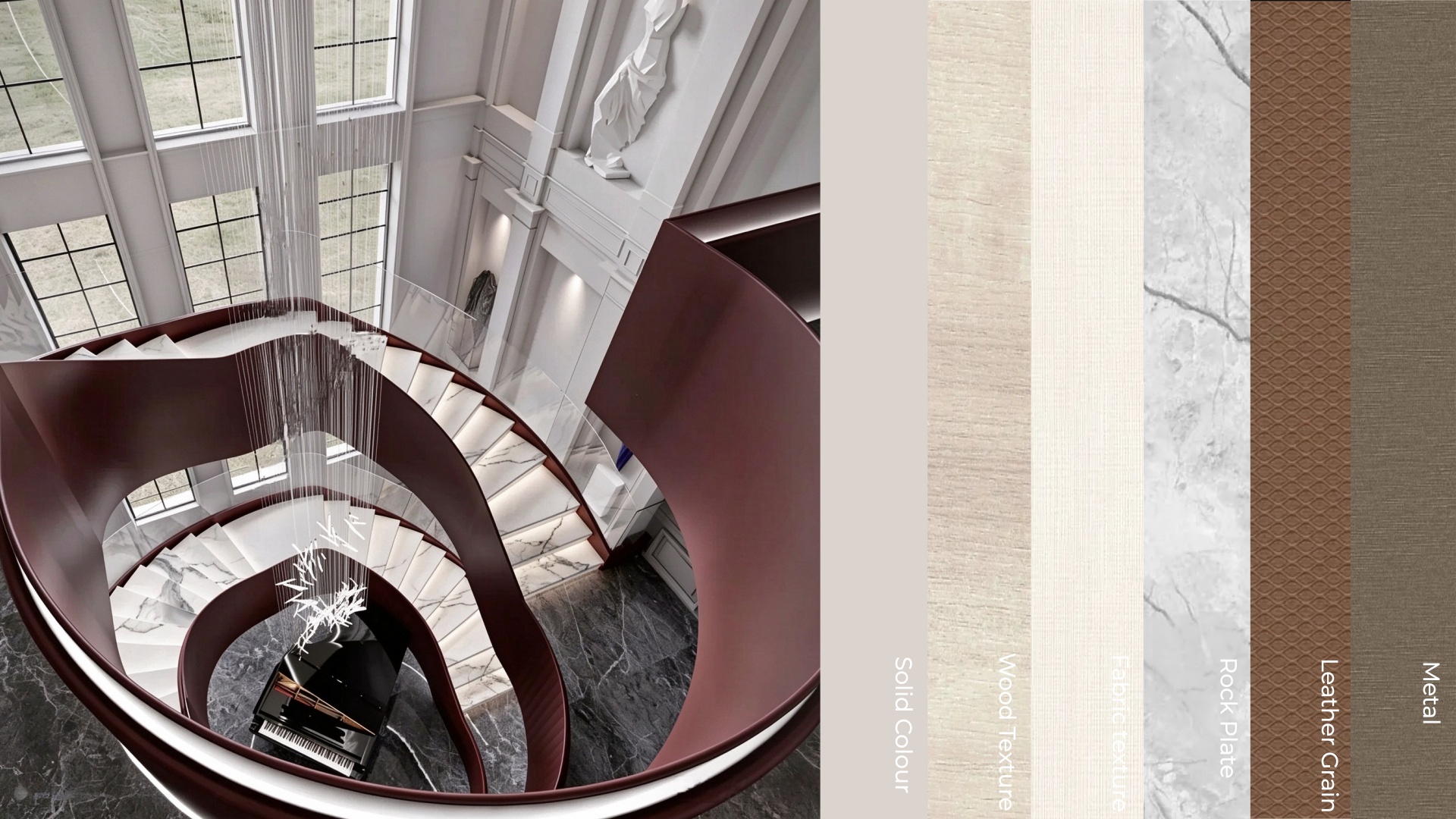
The art series points to expressions beyond conventional colour and wood grain—rock plates, fabric textures, special reliefs, or custom coatings with a faint pearl lustre or metallic particles. It serves spaces that demand not merely "good-looking" but "expressive." A single art-series cabinet door can serve as the visual focus in a minimalist space, no painting or ornament required—its presence is the texture. The "year of touch"mentioned in 2027 trends emphasizes precisely the tactile experience beyond the visual—art-series surfaces can offer the fine-grained feel of natural sintered stone, or the soft diffuse reflection of fabric, letting metal shed its coldness beneath fingertips and light.
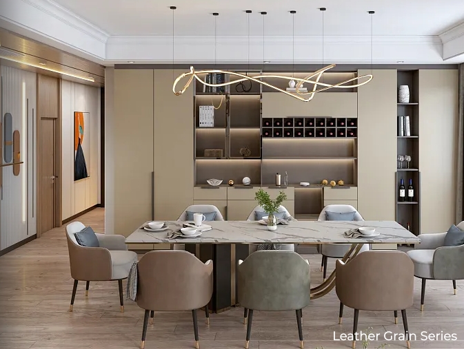
Leather Grain Series: A Gentleness That Doesn't Quite Look Like Aluminium
The leather grain series is the most easily misunderstood—people assume metal should look like metal, yet the matte finish, slight resilience, and fine grain of leather texture dissolve the preconception of "aluminium" almost instantly. It suits bedrooms, walk-in closets, and studies especially well; these spaces need not the crispness of metal but a certain sense of enclosure. Leather grain's diffuse reflection responds to light very softly, and it is especially quiet under evening lighting. Used in an aluminium column-based walk-in closet, leather-grain doors paired with concealed LED strips can achieve a quality close to premium leather interiors without sacrificing moisture resistance or durability.
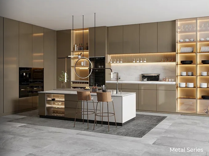
Metal Series: No Need to Avoid Aluminum's True Colour
The metal series is the most honest of all. Anodizing generates a dense oxide film on the aluminium surface, preserving the metal's hue and lustre while enhancing hardness and corrosion resistance. Champagne gold, bronze, silver-white—these colors do not try to disguise themselves as other materials; they say plainly: I am aluminium, and I look good. It suits spaces that need a touch of "edge"—open bookshelves in a study, display cabinet frames in a living room, or accents in a kitchen; metallic lustre offers just the right contrast in a space dominated by matte surfaces. In 2027 design trends, aluminum's role in interior design is being re-examined: it is no longer merely a material for window frames and handles, but a mature surface capable of carrying colour and emotional expression.
Before Choosing a Colour, Think About the Light
There is an easily overlooked prerequisite when choosing colors for aluminium cabinetry: light matters more than the colour swatch. The same solid matte panel, under cool north-facing light versus warm south-facing light, will show a colour-temperature difference significant enough to change the mood of an entire space; the depth of a wood grain also reads quite differently under spotlights versus diffused light. Matte surfaces hide substrate imperfections better than gloss, but dark matte shows fingerprints more readily than light—unless you choose an anti-fingerprint coating version. A practical suggestion: before finalising a colour, always see a physical sample of that surface finish under both natural and artificial light. That small patch of colour on a swatch, placed in your own home's lighting, is often another matter entirely.
The colour and surface of aluminium cabinetry ultimately answer one question: when a material no longer needs to prove its worth by "looking like another material," what can it become? The quietness of solid colour, the warmth of wood grain, the texture of art, the softness of leather grain, the candour of metal—five surface series, five spatial moods. In homeplus's customisation logic, colour is not a "final-step option" but a dimension to be considered from the very start of design. Because the colour and texture of a cabinet wall determine whether it is a silent backdrop or a quiet protagonist in the home. And good customisation, more often than not, achieves both.